Alright, time for another Iron Viz post! After the European edition of the Iron Viz which took place just a few weeks ago (congrats to David Pires for winning on stage in London!), it's time for the next chapter. The Tableau Public team sat down and brainstormed, and in the end came up with Iron Viz goes Safari as a theme. Interesting theme, in my opinion, with loads of data available around the web and tons and tons of different directions go in for analyzing it.
The subject
As usual, finding a good subject not being my strong suite, I looked around to my colleagues, friends and family who would help me come up with good ideas. Some interesting ones came up... Dinosaurs? Perhaps. The occurrences of species in literature (or poetry) over time, using Google's corpus? A bit dull, no? Focus on one species and analyze, find insights and elaborate? Maybe not the most original idea.
Now, the most stupid thing happened. I was going through some old stuff, and stumbled upon the Pokemon cards I had as a kid (oh yeah). A thought came up: "Heh, in fact, Pokemon are just like animals, aren't they...". I figured it wouldn't be the best idea to do an entry about imaginary animals, though. But looking at the cards, something else came up. Each of those Pokemon had certain so called "stats": their speed, hit points, etc. What if... I could do something similar with real animals? And this is how this idea came to life.
The data
Next thing to do, obviously, was to find data to facilitate this comparison of animals' "stats". While I had already set my thoughts on a specific set of characteristics that could make up these "stats":
- Size (length and/or weight)
- Longevity or lifespan
- Speed
Finding sufficient data about sufficient species would determine whether or not this was realistic. In the end, two out of the three original attributes have been kept.
Turns out finding data about each animal's speed was the hardest, but a helpful website Speed of Animals played an important role here. They provide speed data on about 90 species, which seemed good enough.
For the other two characteristics, I turned towards some online databases, being unsuccessful at first, but then finding animaldiversity.org, which proved to be a very comprehensive source of data. The only struggle here was that the data was mostly in unstructured, plain text. Nothing Alteryx wouldn't be able to resolve in a further stage though! While I also found a decent amount of data on length and weight of species here, it turned out during the design process that I couldn't achieve anything that I found interesting enough to display.
Other data that had caught my eye though, was the WWF's data on the habitats of species, or their distribution. Nice... who doesn't like a good map (when it's relevant)? This meant more data to ingest into the process.
Without going into detail, this is basically what was taken care of by the Alteryx workflow (thank God for that):
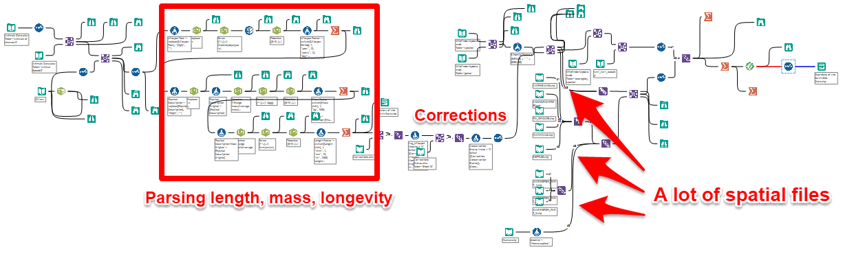
This result of this process is a dataset containing the characteristics we are interested in, as well as a shapefile with the distribution of each species and some additional information (taxonomy, ...)
The visualization
During the building of what will result to be a story, I tried a bunch of different visualizations for each of the attributes, first on paper and then, if interesting enough, in Tableau. At some point in the process, size would be dropped in favor of distribution. A whole lot of technical challenges would rise up as well (the spiral on the Lifespan page is a particularly intricate one), but I believe I have achieved what I want to.
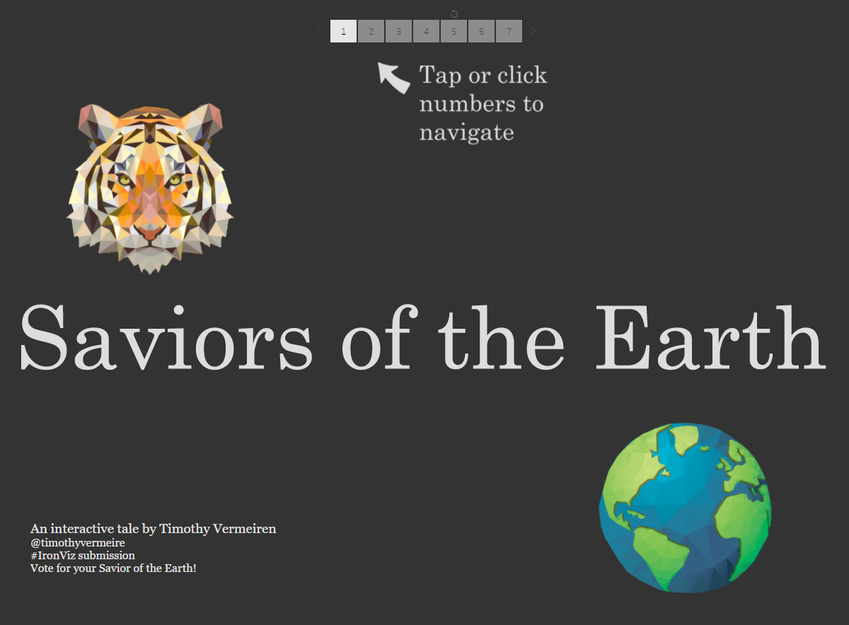
The final result is a story that takes you through, first, the exploration of the three characteristics for all animals, and then, allows you to decide, for yourself, which ones are important. By doing so, you'll assign a score to all of the animals and one of them will rise to be the "Savior of the Earth" (see then actual Tableau Public viz for that).
There's a pretty nifty feature at the end, that allows you to vote on your preferred animal directly from the dashboard. In the next dashboards, the votes from all participants that viewed the dashboard are tallied and displayed! This is based on a hidden Google Forms which feeds a Google Sheet, which is then read into Tableau. Tableau Public recently added the possibility to refresh Google Sheets data extracts on a daily basis, which is being made use of here. The downside is, that the refresh only takes place every 24 hours. But oh well, that'll give you a good reason to come back another day to check the crowd's favorites!
The result
As usual, I feel this has been a very interesting Iron Viz edition, getting me to push my boundaries and learn new things. Already looking forward to the one!
Click the image below to access the viz on Tableau Public and start interacting. Up to you now, to find the species that will be the Savior of the Earth!